After many years of design-new builds and remodels, it was time to create an updated bath for our own home! I kept two parts: the tub (rarely used) and the glass door! Originally there was an angled wall facing the entrance for privacy in the shower but baths are more open now. The restriction was exterior walls on two sides. There was not enough drop for a side drain but we could move the shower to the one outside wall and the door allows for full access to the shower area if needed. The new quartzite Taj Mahal tub surround is deep enough to sit on two sides. Great for sitting while facing the shower or applying lotion after. It’s also a safety feature as you can sit on the surround, pivot and lift your legs into the tub. The limestone floor and shower walls combine with the spa rock, natural stone deco band and Porcelanosa tub facing. The Toto Washlet has been an excellent experience. Shower shelves, hand held spray and grab bar complete the new look. The bath looks much more spacious and inviting plus the new materials are easier to clean.
Filling In A Dropped Floor
After decades of walking through homes and casually advising that lowered floor levels (aka sunken living rooms, dropped floors, conversation pits) can be filled in with concrete or a wooden subfloor, I finally filled in an area in our home! You may recommend having a space filled but if you are lucky you mention it to your favorite general contractor and voila! On the next site visit, it is finished!
We moved the furniture out. The general contractor and concrete sub coordinated the work. We ordered a new door. When it arrived, the sub installed a rebar grid for support. Then the concrete truck arrived (at 5 am!) and the pour began. Several people smoothed and leveled for a couple of hours. (The timing depends on moisture and other variables.). The surface dried untouched for a few days. After a week, tile was installed under the beverage chillers. We rolled out the old carpet as we had just rolled it and slid it to the patio. The footprint of the old carpet was the same so we put the padding strips back and rolled it back in. This makes it convenient to wait a while so the concrete can thoroughly cure prior to wood installation. That installation can be done at our convenience.
The tripping hazard was eliminated and aging-in-place ensues!
Porcelanosa Tile
And the remodeling continues! Gray remains the dominant color. For a recent shower remodel, after an extensive search, it was back to natural materials: cream limestone and Taj Majal quartzite for the tub surround with Porcelanosa tiles on the tub skirt. Maybe the Sherwin Williams forecast of sand tones will soon filter to tile for more options!
Walking the streets of Paris a week later, we saw a Porcelanosa showroom! They have a veneer with a photo finish of real marble that is an improvement over quartz. Great company with great products! Check their website for ideas and products. Porcelanosa is available locally at Facings of America in Phoenix and Scottsdale.
Pillow Impact
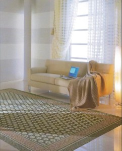
Recently a client of many years wanted to revamp her home to possibly accommodate live-in help. She thought she wanted to open the kitchen to the living room and bar seating for television viewing. However, we decided that expanding the kitchen would have taken too much of the living room space and the existing fireplace would have been less attractive with a television incorporated. Instead we put the television on the wall common with the kitchen. Then added a new sofa, two lounge chairs as well as a table and four chairs for bridge. We changed the draperies from dark to light and used a rug she already owned. The updated look is a refreshing change but the biggest impact was from the pillows! The client had an old, worn rug with perfect colors. The upholsterer based the pillow sizes on the pattern so they are varied. They are the most interesting accent and pull together the room colors. Instead of pairs or common sizes we used varying sizes. What was the media area is now the office and the former office an en suite for a live-in!
Adding new art?
It is so tempting to purchase a new piece of art, get it back to your home and wonder where it will fit in. During my design career I have purchased hundreds of pieces of art! Typically, if the client likes a particular style, the art follows through with their likes. My favorite method is selecting art first! The more open the areas of the home are the more necessary it is for the pieces to complement each other. As you get further into collecting, you consider what location the new piece will occupy and if others will need to be rearranged. Within an area, there should be a main focal point – the outside view, fireplace or a piece of art. While staying at the Peabody in Memphis, our room had a mirror with a scene painted on it in neutral tones. What a discovery! A space needs only one landscape, one floral, etc.
Here is yet another medium to add to the mix. While on my vacation, the client I was working with decided to part with the older bedroom furniture and complete the newer contemporary look. A large mirror was above the pop up TV chest. I suggested we use it in the living room. My miraculous painter added the tree and voila! We had completed the area!
One more option with variety over redundancy!
- 1
- 2
- 3
- …
- 18
- Next Page »