 A good formula for ceilings is the trim color plus 50% white. Cream is better for the ceiling than a dead white. It is also a good place to save $ as it does not need to be washable. Use a reflective, glossy glaze on a low ceiling for height and a matte finish in a darker color on a ceiling that is too high. Don’t use a roller for high gloss, it will create unwanted texture.
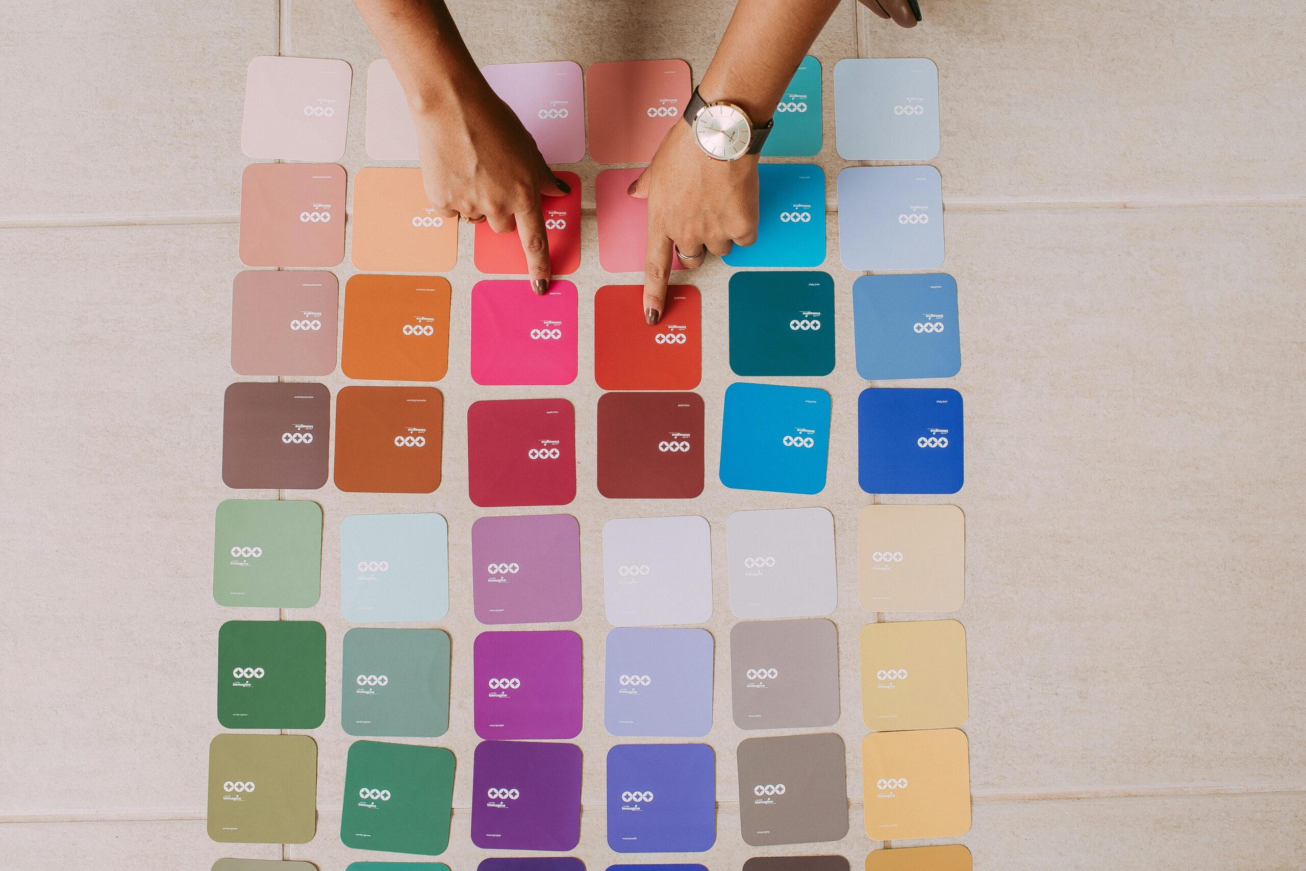
Paint & Wall Finishes
Chalk Paint
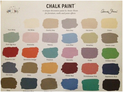 Have you tried Chalk Paint? It has been popular in the U.K. for twenty years. Now it is trending in the US as an inexpensive way to give furnishings a fresh look! It can be a do-it-yourself project or achieve the look through others painting. The thirty colors can be used separately or combined for a deeper color. Do you want fabric to match? The natural dyes in chalk paint allow you to do this. (If you are going to donate it anyway, you might as well experiment!)
Wallpaper Use
Use wallpapers in unexpected places such as ceilings, sections of a hall or the guest closet.
Adding new art?
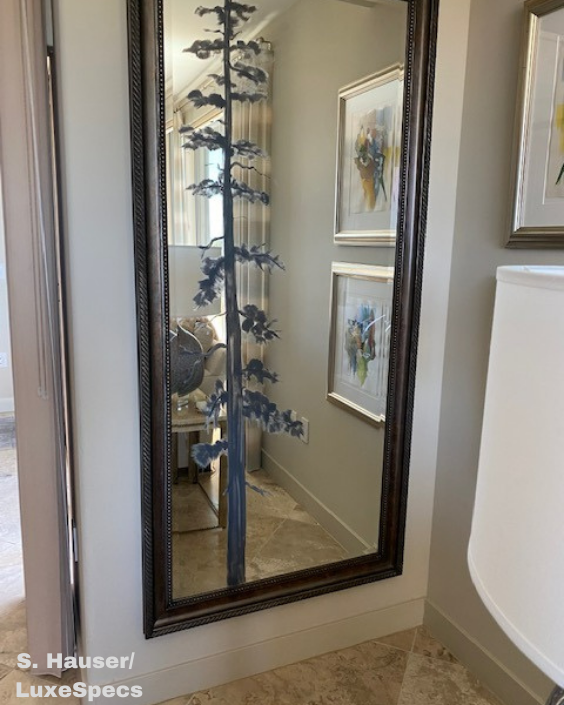 It is so tempting to purchase a new piece of art, get it back to your home and wonder where it will fit in. During my design career I have purchased hundreds of pieces of art! Typically, if the client likes a particular style, the art follows through with their likes. My favorite method is selecting art first! The more open the areas of the home are the more necessary it is for the pieces to complement each other. As you get further into collecting, you consider what location the new piece will occupy and if others will need to be rearranged. Within an area, there should be a main focal point – the outside view, fireplace or a piece of art. While staying at the Peabody in Memphis, our room had a mirror with a scene painted on it in neutral tones. What a discovery! A space needs only one landscape, one floral, etc.
Here is yet another medium to add to the mix. While on my vacation, the client I was working with decided to part with the older bedroom furniture and complete the newer contemporary look. A large mirror was above the pop up TV chest. I suggested we use it in the living room. My miraculous painter added the tree and voila! We had completed the area!
One more option with variety over redundancy!
Color Makes Big Impact
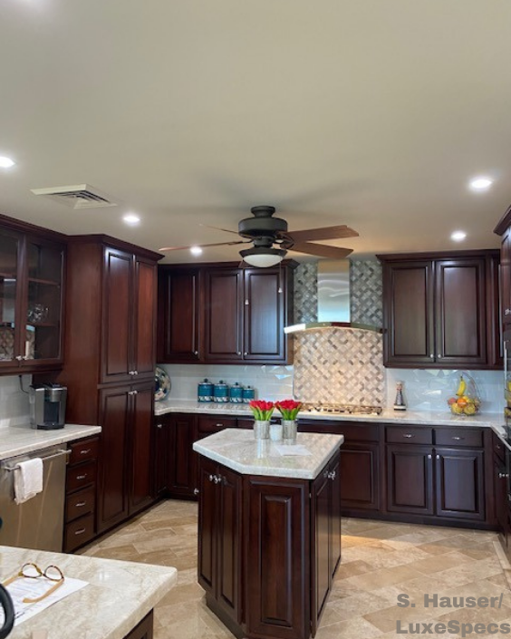
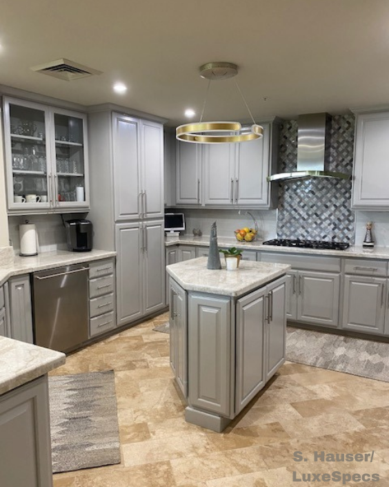
From dark to light is the least expensive way to make changes to your décor whether it be wall color or cabinetry. In this home, the client selected a gray tone even though my color choice was slightly closer to the travertine color on the floors. The rugs in the kitchen with both colors pulled the palette together. A new lighting fixture replaced the ceiling fan. An updated lighter look!
How To Add a Contrast Wall
We’ve all been in the white wall phase for a few years now and it’s time to add some contrast! The new photos on my Paint and Wall Finishes board on Pinterest will give you inspiration to add a dark wall -charcoal, navy, purple? You may need a second opinion (like a great interior designer!) as not every area will be enhanced by this addition, but in the right place it adds the wow! Add it to unify space in the hall with the great pop of color at the end. Powder rooms are often conducive to a dark contrast. Bedrooms become cozy incubators. And there is always the man-cave / office with an alternative to dark wood. Take a look at your spaces and go from boring to brilliant!
The Joy of Yellow in Design
I have had a yellow room in my home during most of my adult years! This year every shade of yellow is big in women’s fashion. Which means we will see more and more of it in home furnishings. See some examples on my Paint and Wall Finishes board on Pinterest. A color often used to chase the gray of the Pacific northwest, it is a favorite of bright and sunny people no matter where they live! We have over 300 hundred days of sunshine in the Southwest but adding more inside just adds to the upbeat mood. It can be subtle: a light tint for a warmer off-white base color, a perfect backdrop for your blue and white dishes in the kitchen or dining area, a warm and inviting powder room or bedroom. With all of the gray tones currently in use, yellow is a perfect color to add. An accent pillow, a bowl of lemons by the bar or flowers on the table… the pop of color creates visual impact. It is also beautiful with white moldings. A classic! Always worth consideration!
Make Your Own Collection
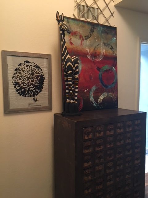 An antique apothecary chest holds all items that don’t have another home. An interesting piece of furniture combined with contemporary art, an elephant foot print and Zebra sculpture. Mix it up for interest!
