 Can a designer save you money? That’s a resounding yes! As the quote warns “Just because you can, doesn’t mean you should.” Throwing money at all details does not always create the defined focal points that separate a great look from a confusing one. Scale is so important! Great architects have it as do great designers. But a lot of input on interiors, especially remodels, come from other resources and may never achieve the room’s potential regardless of the money spent.
Design
Outdoor Options from Kalamazoo Gourmet

Kalamazoo Gourmet has a countertop pizza oven, outdoor-rated dishwasher and other great outdoor options!
The Right Ceiling Height
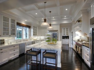 When remodeling take every ceiling and door way to a least 8’ and raise as many ceiling above 8’ as you can afford. I tour luxury homes every other week and hear the feedback of the realtors selling luxury homes. They recognize low ceilings as older sections of the house that have not been remodeled. Use 9’ – 10’ feet for secondary rooms and 10’-14’ for larger areas. Continuous 8’ ceilings are boring and too low to add ceiling details like beams.
The main entertainment/living area should have at least 10’ ceilings. Ten to fourteen feet for rooms that are in excess of 20’ x 20’ A high ceiling in a small room has an uncomfortable feel. An overly high ceiling in a large room needs attention to detail in the upper half of the room that adds another cost factor and reduces the feeling of intimacy that many people find appealing. Hire the best professionals available to get the right guidance as proportion and scale are the most important factors in a room feeling finished and comfortable.
Is Art An Investment?
 Apparently! Francis Bacon’s Three Views of Lucian Freud just sold for $142.4 million at Christie’s in New York City! At Sotheby’s Andy Warhol’s “Liz #1” sold for $20,325! We’ve heard the recession did not affect everyone! Do you have a favorite piece that you bought many years ago from a good, but as yet unknown artist? My clients who have purchased from Scottsdale, AZ galleries have been pleasantly surprised to find the artists they have pieces from are in demand when they want to sell them. Of course, Antiques Road Show is a sure motivator with their recovered treasures! The real test is if you love it and enjoy living with it – that makes it priceless! (Unless you get a great offer!)
Family Photos
 Family photos are the most personal part of your home. If you enjoy having some out, here are a variety of ways to use them:
- They are typically in the private areas of your home – shelves added in the master bedroom, hallways to bedrooms and large master bath and closet areas are all great for these photos.
- If the frames are all the same color and the photos are large enough to see the subject they make a nice hall family wall.
- Old photos can now easily be enlarged to showcase interesting family history.
- While framing all at once would be easier, they can be framed with different framing if the color is consistent. Frames can be painted as well.
- For a contemporary look, it is interesting to use 3-5’ sections showing your children all at the age of 2 or 3 in sepia or gray tones.
- Silver frames grouped together are always a great look.
- If you want to have the option of not always having them on display, then a open cabinetry section with bi-fold doors which allows you to close them off for a business meeting or large function.
- Photo albums can be stored nearby if you are constantly shifting new photos in to the frames.
- Snap a picture with the smartphone app Instagram then use Instacanvas to print your photo onto stretched canvas!
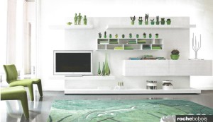
Hide your TV
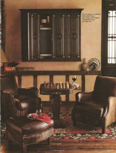 If looking at the black screen is not desirable, there many options for integrating your TV using wood framing or
 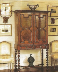 stone. If you want to hide it completely, cabinetry such as this one from Horchow or an antique cabinet won’t call attention to the TV. On the other hand, this Rochebobois photo uses the screen by accessorizing to give balance.
