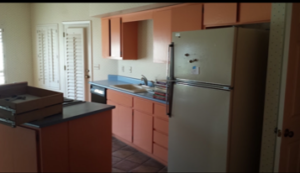
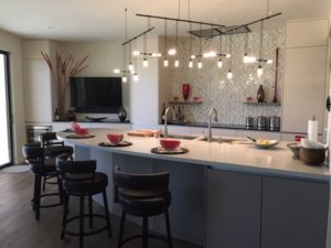
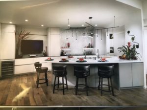
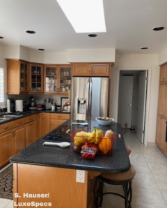
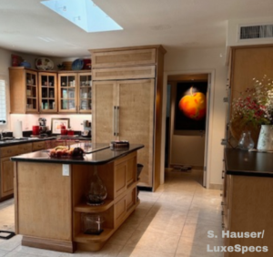
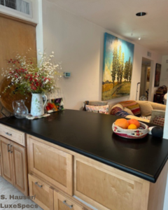
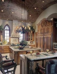
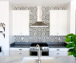
What happens when a contractor/owner, award winning interior designer and an experienced showroom owner of European cabinetry walk into a bar-less kitchen? Investigation ensues! We are looking for supporting walls to see how much can be removed! In the kitchen pictured, the supporting wall was on the right in the photo and now anchors the island. State-of-the-art Miele appliances allow the typical old kitchen look to disappear and the new integrated kitchen to emerge. What was a separate dining room and living room are now combined into one open space. Visual space with freedom for homeowners and guests to interact is the new norm. An original door to the exterior (There were already sliding doors.) was eliminated and a flat screen TV that can be viewed from the island and dining area was added.
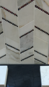
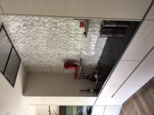
If you can’t find the appliances, we have achieved our goal! The seamless cooktop in black surrounded by black granite with the granite, marble, mirror and metal combination mosaic as the new focal point of the wall. The hood is directly above the cooktop – another new option! The island has a quartz seamless top. Suspended lighting in modules completes the look with added cans above. This is the third kitchen this team has created and even with visuals to assist homeowners with the “new” look a trust factor between team members allows for more creativity. Let the tear out begin!
