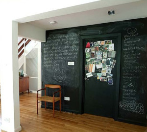
We’ve all been in the white wall phase for a few years now and it’s time to add some contrast! The new photos on my Paint and Wall Finishes board on Pinterest will give you inspiration to add a dark wall -charcoal, navy, purple? You may need a second opinion (like a great interior designer!) as not every area will be enhanced by this addition, but in the right place it adds the wow! Add it to unify space in the hall with the great pop of color at the end. Powder rooms are often conducive to a dark contrast. Bedrooms become cozy incubators. And there is always the man-cave / office with an alternative to dark wood. Take a look at your spaces and go from boring to brilliant!
The Joy of Yellow in Design
I have had a yellow room in my home during most of my adult years! This year every shade of yellow is big in women’s fashion. Which means we will see more and more of it in home furnishings. See some examples on my Paint and Wall Finishes board on Pinterest. A color often used to chase the gray of the Pacific northwest, it is a favorite of bright and sunny people no matter where they live! We have over 300 hundred days of sunshine in the Southwest but adding more inside just adds to the upbeat mood. It can be subtle: a light tint for a warmer off-white base color, a perfect backdrop for your blue and white dishes in the kitchen or dining area, a warm and inviting powder room or bedroom. With all of the gray tones currently in use, yellow is a perfect color to add. An accent pillow, a bowl of lemons by the bar or flowers on the table… the pop of color creates visual impact. It is also beautiful with white moldings. A classic! Always worth consideration!
Dunn Edwards Paint Made Here in Phoenix!
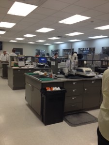
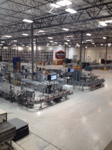
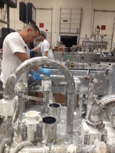
Dunn Edwards is California based with the production plant in Phoenix. Their paints are formulated for the Southwest and its intense heat.
Update a Hallway
Choosing Trim Paint Colors
A good formula for ceilings is the trim color plus 50% white. Cream is better for the ceiling than a dead white. It is also a good place to save $ as it does not need to be washable. Use a reflective, glossy glaze on a low ceiling for height and a matte finish in a darker color on a ceiling that is too high. Don’t use a roller for high gloss, it will create unwanted texture.
